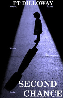
I was working on some covers for my Chances Are series. I was trying to find stock photos, but then I saw a neat picture on Fotolia and got another idea. This was the picture, although it was in black-and-white, not blue and obviously it didn't have text on it.
Anyway, the silhouette and shadow gave me an idea. In the first book a grizzled cop named Steve becomes a young woman named Stacey, so I thought of using a woman's silhouette but with a man's shadow, like this:
In the second one Stacey becomes a little girl, so this one has a little girl's silhouette with a woman's shadow:
Finally in the third one she's getting married, but a killer Steve put away 25 years ago breaks out of jail to come after her. So I thought to use a bride silhouette and then a skeleton shadow.
I'm not thrilled with the skeleton; I think I need to find a better picture for it.
Anyway, these are just prototypes. I'm just curious what you think of the concept, if it's neat or if it's stupid.


11 comments:
A little like the Phantom Menace promos with little Anakin casting the shadow of Darth Vader.
I do like the concept but I also have problems with the skeleton, which doesn't register as a shadow.
I like the first two. It's not just the skeleton that bothers me about the third one, it's the concept for it. The first are clear, um, reflections of each other, but, unless she actually dies, the third one does not have the same symbolism as the first two.
I love the concept. I think the only Star Wars poster I ever bought was the Annakin Skywalker one with the Vader shadow. I'd go with it.
I like the shaft of light concept. But I agree with you and others, the skeleton doesn't work for me. Nice job!
S
I'm with most other people here: yes, yes, no.
I like the idea of the shadow with opposite sexes...maybe man with woman shadow....hmmmm
I like the idea of the shadow with opposite sexes...maybe man with woman shadow....hmmmm
I like the concept, but I feel it needs some adjustments. Chance of a Lifetime, for example. I would have the woman not be a shadow. I'd like to see her with an expression on her face about what he/she went through. Some sort of emotion to reflect her mood. Then bring her more to the front/right. Put the shadow of the man behind her on an angle, going off to the left. I'd experiment with the title so it stands out more.
Of course if your photoshop skills are like mine this won't be easy.
Anyway, it sounds like a cool story.
I think your covers are very clever and encapsulate the theme within the books. You should be proud.
Those really are great. Seriously. That would make me stop in the store and pick up those books.
Post a Comment