

Only the titles are obviously different. The concept of the story is the same, except instead of Reagan-era paranoia about the "Evil Empire" starting WWIII, I'm using that old standby of a zombie apocalypse. With zombies running amok, the few human settlements left have become widely scattered and the only way for them to trade with each other for supplies necessary to their survival is through the air. But this has given rise to "air pirates" who are exactly what you think. There's also a mysterious hero in a strange airplane who's known only as the "Sky Ghost" who defends the innocent from air pirates--sort of like Batman in a plane.
So here are some cover ideas I came up with, using the above cover as my inspiration. There's a little bright purple outline around the cockpit and logo that's because I'm mocking these up in PowerPoint and it's not real great at making things transparent. And if you see any "Fotolia" logos it's because these are just rough comp images.
#1 Bangkok is Burning:
Getting a picture of a city on fire is really hard for whatever reason. Stupid stock photo sites. This picture is of Bangkok I guess but the story does not take place in Bangkok.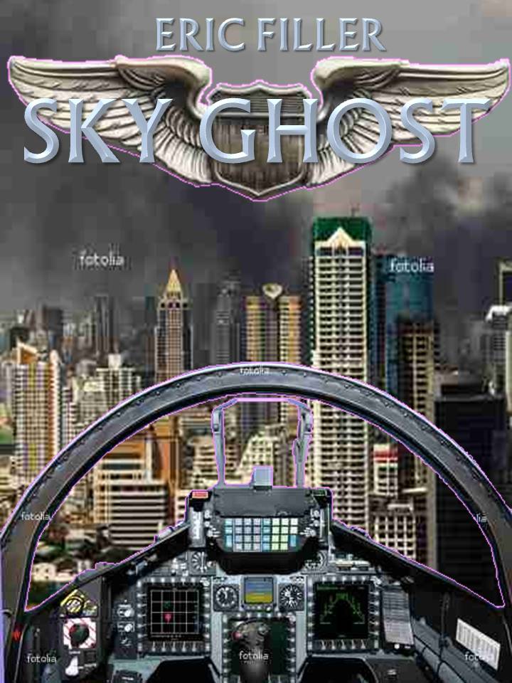
#2 Dogfight!
Of course if you put in "dogfight" on a stock photo site all you get are pictures of dogs. Seriously. So I just used a picture of a lake and added in a couple of planes. The advantage of this one is it should actually be like a scene from the book.
#3 Apocalypse Now!
This is what the artist calls "gloomy apocalypse landscape" which I suppose is somewhat appropriate
#4 Apocalypse in Blue
It's pretty much the same background only tinted blue
#5 This City's on Fire:
This is a wallpaper of a city burning that I downloaded. I redid this one in Paint Shop Pro which is why the text looks like shit. I don't have PowerPoint on my computer at home since the one that did have PowerPoint is on its way back to the factory. I think it's my favorite, which probably means everyone else will hate it.
5 comments:
I like #5 the best because it suggests conflict. But as you said, the text needs fixed and the pilot console is not as clear as the others. I'd like to see the image a little lighter too. But yes...I agree with you.
I like the last one best. It most suggests something bad has happened. What sort of plane is your character flying?
Number 5 for me. Although seeing other planes I've over the city would be cool too.
I kind of like the all-blue one, but clearly I'm in the minority here. If you go with the one everyone likes, though, that'd be okay, as it's good, too.
I like #5 best but the interior of the plane needs to be warmed up a bit. Too cold against the warm background.
Post a Comment